Overview
WhichRealEstateAgent.com.au is a platform designed to help homeowners find and compare local real estate agents. The website serves as a critical tool for those navigating the complexities of selling a property by offering unbiased comparisons of agents in their area.
When I took on the project, the website was functional but visually outdated and lacking in user experience. My mission was to revamp the design, improve navigation, and enhance the user experience across all devices.
Project Scope
• Client: WhichRealEstateAgent.com.au
• Duration: March - August 2024
• Role: Lead Designer / Web Designer
• Duration: March - August 2024
• Role: Lead Designer / Web Designer
• Objectives:
• Modernize the visual design
• Improve navigation and user experience
• Enhance mobile responsiveness
• Optimize site performance
• Create a thank-you page funnel for leads
• Design a dashboard for real estate agents to manage their profiles and leads
• Maintain existing SEO rankings
• Improve navigation and user experience
• Enhance mobile responsiveness
• Optimize site performance
• Create a thank-you page funnel for leads
• Design a dashboard for real estate agents to manage their profiles and leads
• Maintain existing SEO rankings
Tools Used
• Figma
• Adobe Photoshop and Illustrator
• Adobe Photoshop and Illustrator
Approach
1. Discovery & Research: After analyzing competitors and trends in the real estate sector, I held discussions with the client to pinpoint user pain points and goals. A deep dive into user behavior data helped inform design decisions.
2. Wireframing & Prototyping: I developed wireframes to establish a new layout for the site, focusing on simplifying navigation and emphasizing key content areas. Interactive prototypes were shared with the client for feedback before moving into the final design phase.
3. Design Execution:
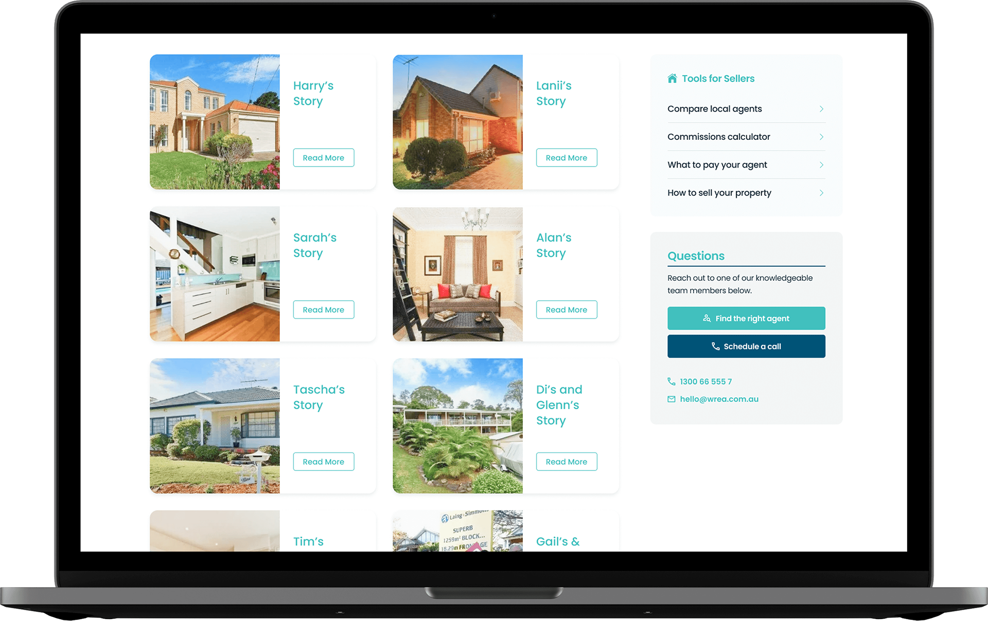
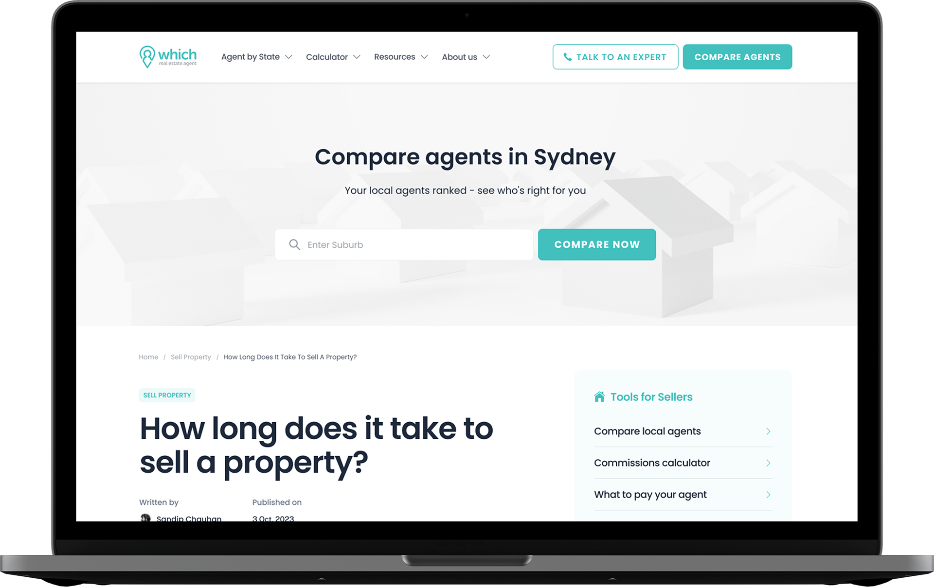
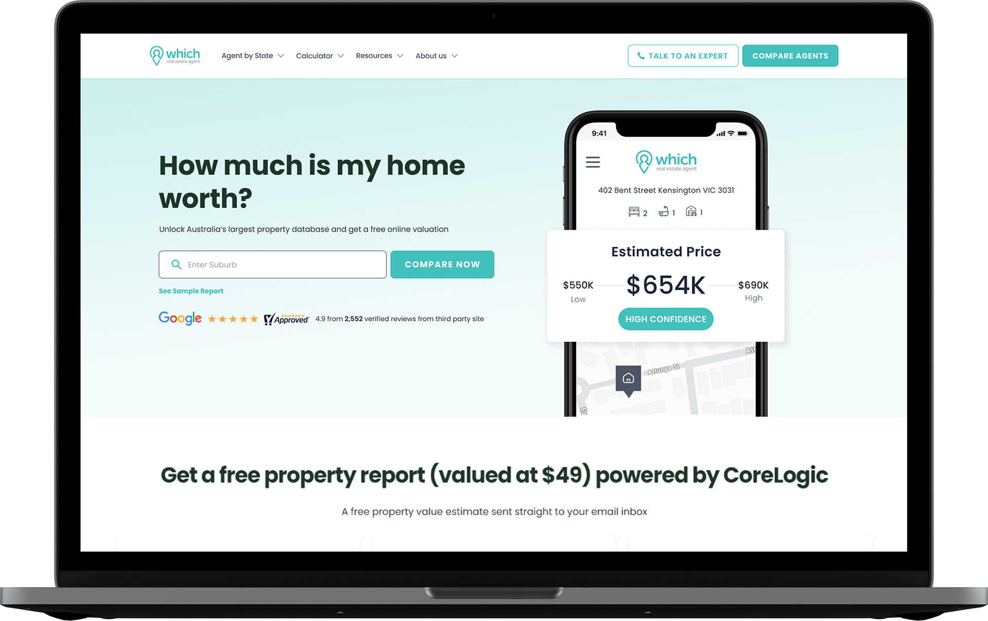
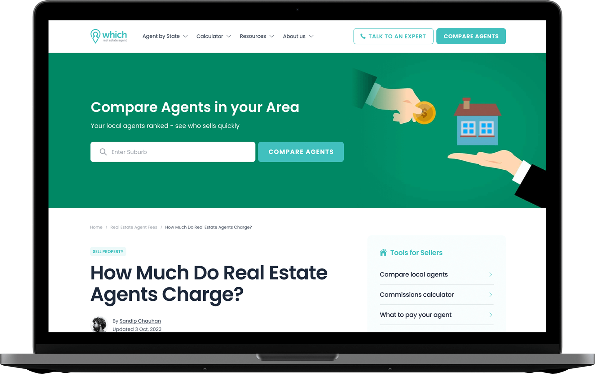
• Modern Aesthetic: I revamped the look with a clean, minimalistic style. The refreshed design included a contemporary color palette and updated typography to give the site a modern, approachable feel.
• Responsive Design: The new design was optimized for all devices, ensuring a seamless experience whether viewed on desktop, tablet, or mobile.
• Visual Hierarchy: I enhanced readability and usability by improving the layout structure, using larger headers, and strategically placed call-to-action (CTA) buttons.
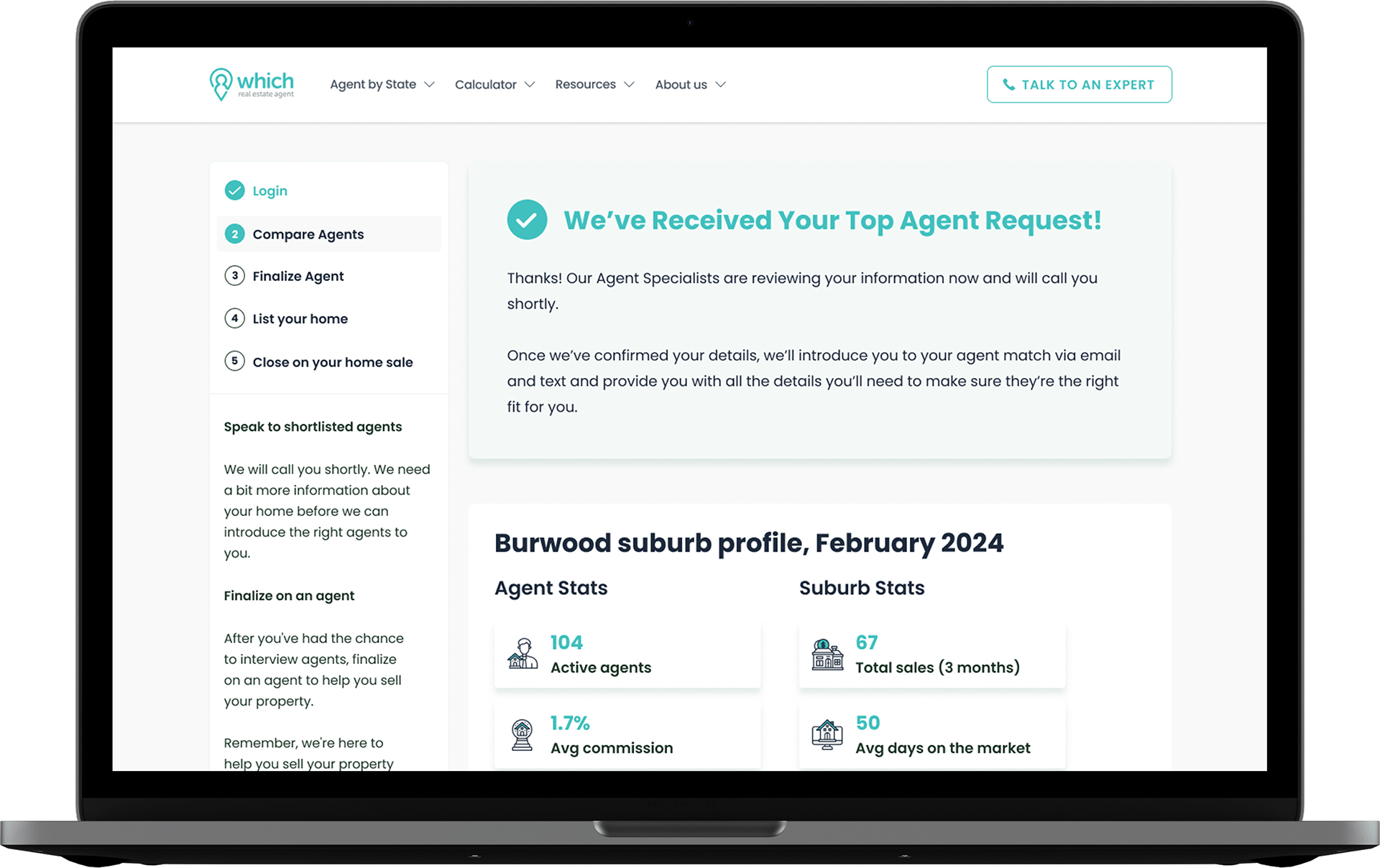
• Thank-You Pages: I created customized thank-you pages that display after users submit inquiries or complete actions, guiding them through the next steps. These pages are also optimized for lead nurturing and engagement.
4. Performance Optimization: The performance of the site was critical, so I employed a range of optimization techniques:
• Image compression and lazy loading for faster loading times
• Minimized CSS and JavaScript files to enhance speed
• Enabled browser caching to improve site responsiveness
5. User Experience Enhancements:
• Simplified Navigation: The new structure reduced the complexity of the user journey, making it easier for visitors to find agents and related information.
• Clear CTAs and Thank-You Funnels: I integrated visible CTAs throughout the site and created thank-you pages that reinforce engagement, providing next-step actions and confirming inquiries.
6. Testing & Launch:
I conducted extensive user testing to ensure that the website performed well across different browsers and devices. Post-launch, I worked closely with the client to monitor user feedback and tweak areas that could further improve the user experience.
Results
• 45% increase in user engagement: Visitors now spend more time exploring the site, thanks to the modern design and improved user flow.
• 25% boost in mobile traffic: The mobile-first design resulted in a noticeable increase in mobile visitors.
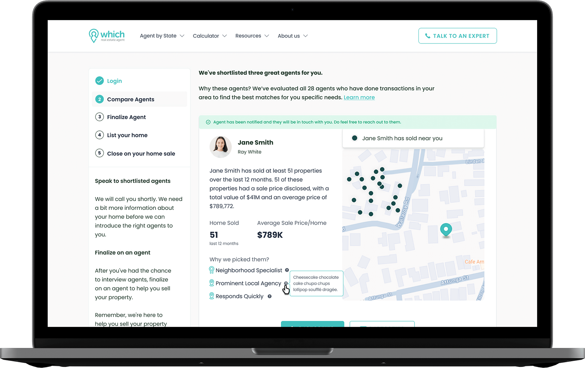
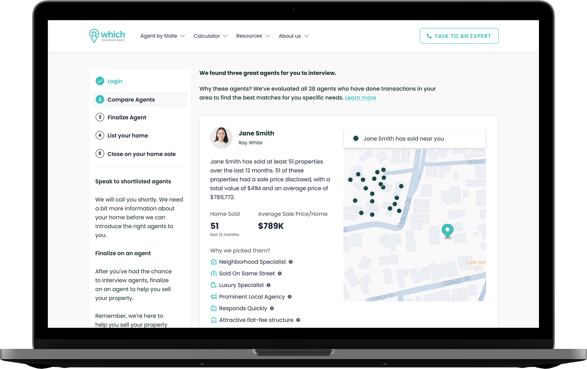
• Agent Engagement: The introduction of the agent dashboard led to greater interaction from real estate agents, who now have better control over their listings.
• Improved Conversion Rates: The new design and clear CTAs, including thank-you pages, resulted in a significant increase in leads generated through the site.
Conclusion:
The redesign of WhichRealEstateAgent.com.au transformed the platform into a modern, user-friendly experience. The integration of agent tools, mobile optimization, and performance improvements have positioned the site as a leader in its field. The new features, such as the thank-you pages and agent dashboard, have enhanced both user engagement and agent interaction.
If you’d like to see the results or explore the new design, visit the live website here.
